Chris Buck
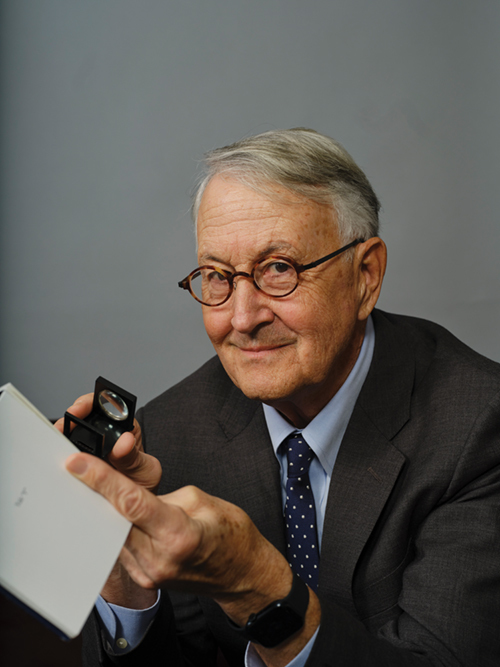
John Gambell ’81MFA helped define the look of Yale for 25 years as university printer before his recent retirement.
View full image

Chris Buck
John Gambell ’81MFA helped define the look of Yale for 25 years as university printer before his recent retirement.
View full image
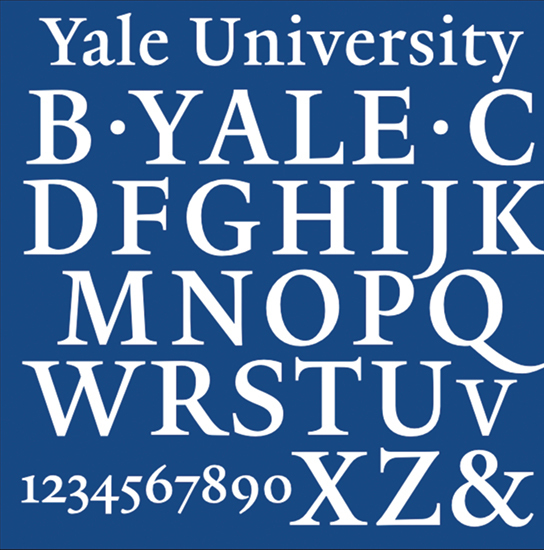
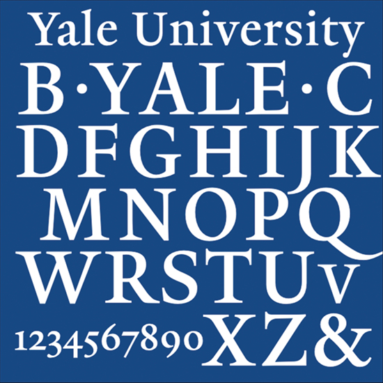
Among the projects Gambell stewarded was the development of consistent signage for the university with a custom typeface designed by Matthew Carter.
View full image

Among the projects Gambell stewarded was the development of consistent signage for the university with a custom typeface designed by Matthew Carter.
View full image
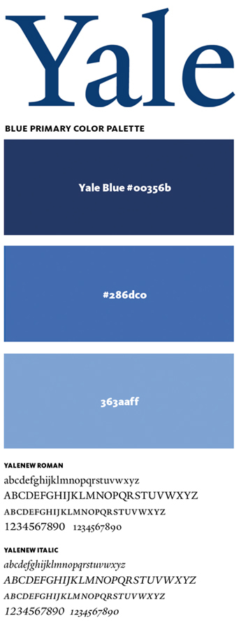
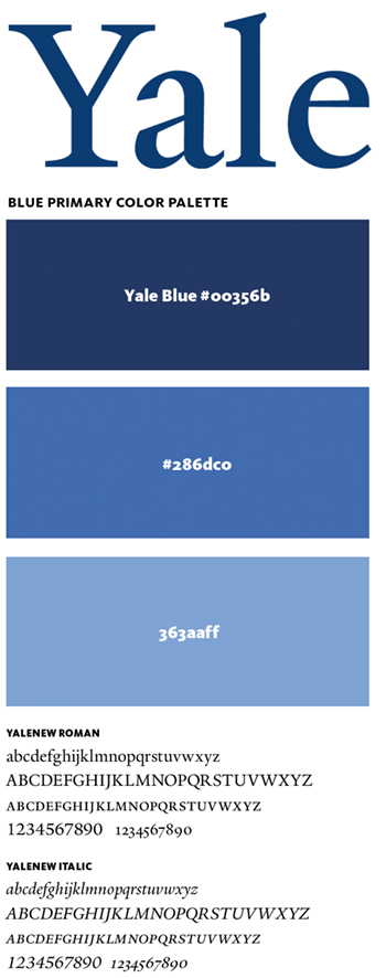
The Office of the University Printer develops—and helps the university maintain—a consistent identity. The Yale logo (top) is derived from the university’s typeface (above) —known simply as Yale and created by designer Matthew Carter. The office also has standards for colors to be used in Yale materials; the ones above are suggested for use online.
View full image
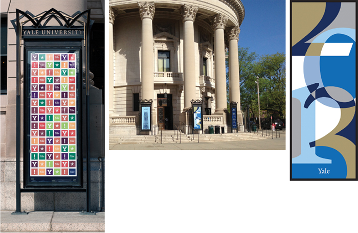
Those cheerful posters that liven up the area outside the Memorial Hall rotunda? They are often designed by Gambell’s office. The ones shown here were created by recent graduates working in the office as Rollins Fellows.
For the opening of the Center for Engineering Innovation and Design in 2012, Chika Ota ’11 created a banner (top) to go across the long glass façade of the center’s home in the Becton Center.
View full image
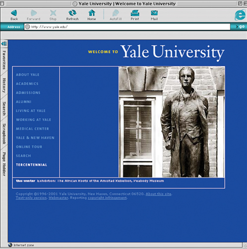
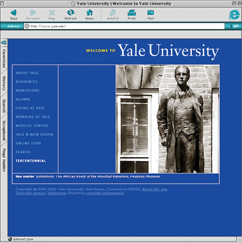
One of Gambell’s first jobs as university printer in 1999 was to revamp the university’s home page. He hired designer Michael Rock of the firm 2x4 to create a clean, functional index page that became known as “the blue site.” It was influential in a time when web design was often frenzied and chaotic. Jonathan Corum ’95 did the coding.
View full image
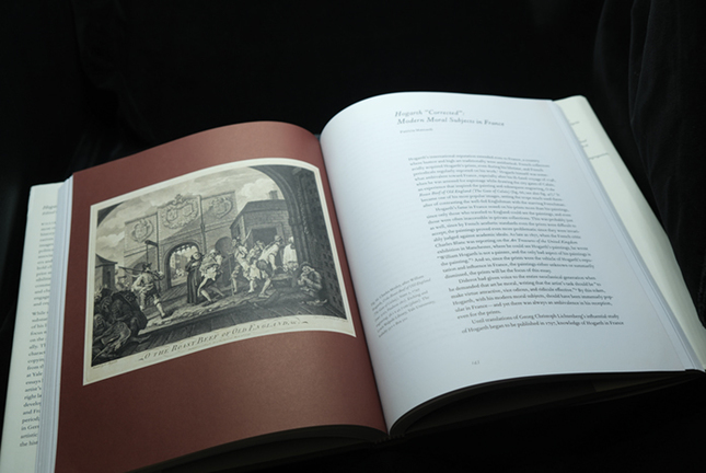
Gambell’s design sensibility has been shaped by years of work on books and exhibition catalogs, like “Hogarth’s Legacy” (2016) for Yale’s Lewis Walpole Library.
View full image

Gambell’s design sensibility has been shaped by years of work on books and exhibition catalogs, like “Hogarth’s Legacy” (2016) for Yale’s Lewis Walpole Library.
View full image
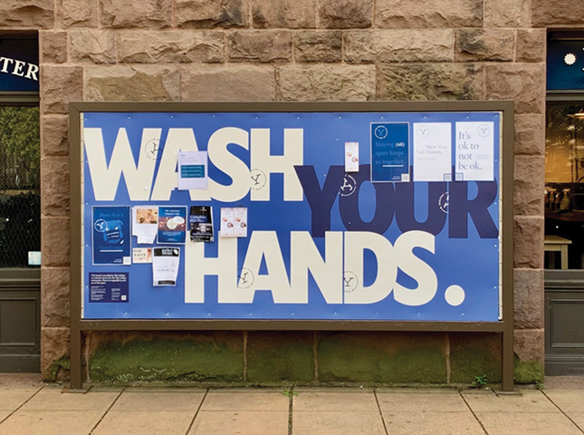
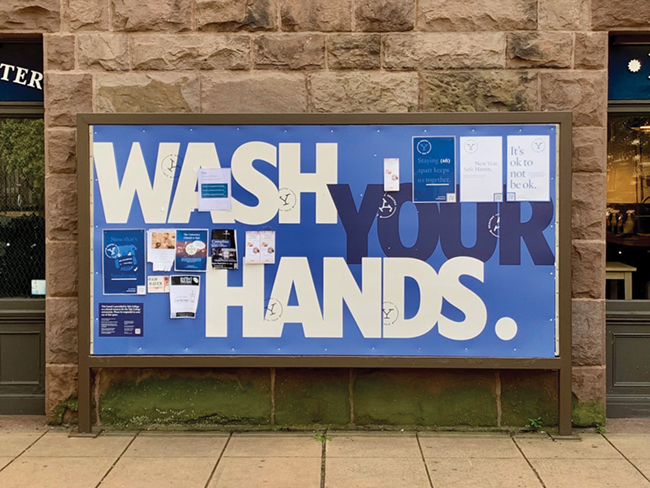
The late Anton Sovetov ’16MFA, a designer in Gambell’s office, created large-scale public health messages for Yale bulletin boards when students returned to campus during the COVID-19 pandemic.
View full image

The late Anton Sovetov ’16MFA, a designer in Gambell’s office, created large-scale public health messages for Yale bulletin boards when students returned to campus during the COVID-19 pandemic.
View full image

With Yale Printing and Publishing, Gambell’s office established a consistent style for university vehicles.
View full image

With Yale Printing and Publishing, Gambell’s office established a consistent style for university vehicles.
View full image

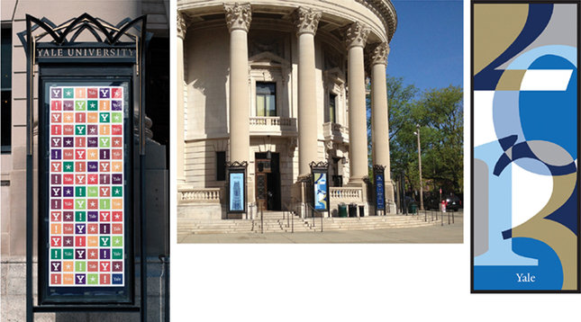
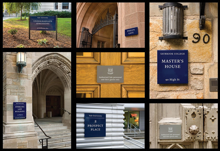
In 2003, new signage by the firm 212 Associates began appearing on campus.
View full image

In 2003, new signage by the firm 212 Associates began appearing on campus.
View full image
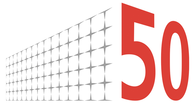
The Office of the University Printer creates graphic identities for events and programs at the university. For the Beinecke Library’s 50th anniversary in 2013, Rebecca Martz, who recently succeeded Gambell as university printer, produced a logo incorporating the library’s gridded façade.
View full image
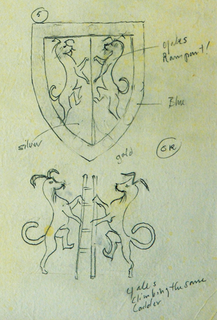
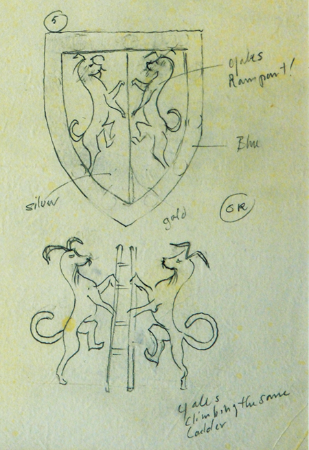
When Yale created the office of dean of the Faculty of Arts and Sciences in 2014, the university decided that FAS needed its own shield like those of the university’s schools and residential colleges. Gambell developed ideas in sketches incorporating the mythical beast called the yale.
View full image
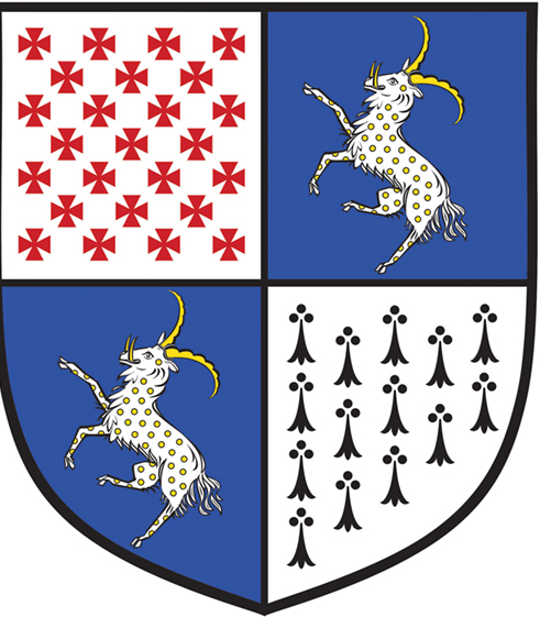
The final product features rampant yales in two quadrants; the other two include Maltese crosses—-a reference to former Graduate School dean Wilbur Cross—-and ermine from the Yale College shield. Gambell also designed shields for the School of Engineering and Applied Sciences, the Jackson School of Global Affairs, and Grace Hopper, Benjamin Franklin, and Pauli Murray Colleges
View full image
No matter what direction you’re coming from, when you approach the Yale campus, your first encounter will probably be with a blue sign. The color tips you off, of course, but there’s also that typography. Most signs use sans-serif lettering, bold and blunt: think STOP, or TRUMBULL STREET 1/4 MILE. But the blue signs are different. They have an elegant, classic typeface: white on Yale blue, carefully spaced as if on the title page of a classic book. If you’re an alum, seeing one of those blue signs says you’ve come home.
These signs are part of a complex system of visual cues, carefully considered and coordinated, that weave all the parts of Yale together—from its website to its admissions brochures to the signs on every classroom door—into a unified brand, no less consistent and powerful than Apple or Coca-Cola. And what almost no one knows is that the person responsible for the Yale brand is someone who’s been steeped in it for more than four decades: John Gambell ’81MFA.
Until he retired in January, John Gambell’s official title for 25 years was university printer, something he calls a “ceremonial misnomer.” Operating with that unlikely designation, Gambell ran an office that now has six full-time employees whose responsibilities include branding, maps and signage, donor recognition, major design projects, and the editing and production of the university’s course catalogs. But his reputation rests, more than anything else, on his uncanny ability to identify the subtle cues that simply make something—for lack of a better phrase—look like Yale.
The role of Printer to the University was established in 1920 by Carl Rollins, principal designer for Yale University Press. A legendary book designer, Rollins won dozens of awards in the American Institute of Graphic Arts’s annual Fifty Books of the Year competition, and was said to have originated the typographic treatment of footnotes and bibliographies that are today regarded as standard. But along with over 2,000 books, he created everything from menus to prom tickets, becoming Yale’s de facto arbiter of visual style.
From a design point of view, says Gambell, Rollins “was the conscience of the university.” His influence would be imprinted on successors to Rollins such as Greer Allen ’45W and Roland Hoover ’49, and it would inform Alvin Eisenman’s founding, at the School of Art in 1951, what would become the country’s preeminent graduate graphic design program.
It was there that John Gambell, an English major from Middlebury College, found himself as an MFA candidate in 1979. During his studies and after graduation, he worked for the University Printing Service on the Yale College admissions viewbook, and on catalogs for the Art Gallery and the Center for British Art. What might have been merely a job, Gambell says now, was an “incredibly useful educational experience” as he came to understand “the book, and typography, as a kind of persuasive art”—as well as the unique graphic sensibility that distinguished Yale from its peers. Central to this sensibility was the craft of printing, with ink and paper and manual letterpress machines still in operation into the 1980s.
This all began to change over the next decade with the rise of digital reproduction and desktop printing. What had once been centrally administered by experts was now in the hands of dozens if not hundreds of people. “Suddenly desktop publishing just swept the campus,” Gambell remembers. “Everything was now done by somebody’s kid who had just learned PageMaker. It was a mess.” By the early 1990s, the ubiquity of personal computers had reduced Yale’s publications, once models of elegance and understatement, to a riot of garish clip art and free downloadable fonts.
People who cared about Yale’s image noticed, and they began sending examples of substandard communications to the office of President Richard Levin ’74PhD. Yale Secretary Linda Koch Lorimer ’77JD set out to solve the problem.
At that point, Gambell had been working as a designer on and off campus for 18 years. He was the perfect man for the job. Lorimer put a range of material bearing the Yale name out on a table in front of Gambell and said, “There’s no longer a family resemblance among this stuff. It needs someone to make it go together. Do you want this job?” And he said, “Yeah, I’ve always wanted this job.”
But what was the job? “I thought it was running the design side of the printing office, but in Linda’s thinking I would be a kind of free-floating design consultant,” says Gambell. One of his first assignments was a big one: updating the Yale website, which—as was typical in the early days of the internet—was cluttered and hard to use. He replaced it with a matter-of-fact index that was both straightforward and elegant, still remembered by many as “the blue site.” It would influence the digital presence of institutions of higher learning for years.
It was the next big project that proved truly consequential. Architects Cooper, Robertson & Partners had been commissioned to create a campus master plan to usher Yale into the new millennium. Along with ideas for new buildings, ambitious landscape improvements, and whole new districts was an observation that seemed almost an afterthought: there were hundreds of signs all over campus, and almost none of them looked alike. The university saw an opportunity. “The idea of our campus is that it’s hugely varied from an architectural point of view,” Gambell says. “And the campus keeps expanding, visitors are getting lost, and it doesn’t look like it all hangs together. And signs can make a big difference with this.”
Working with designer David Gibson ’80MFA of the firm 212 Associates, Gambell proposed a consistent, universal building identification and wayfinding system. He argued that, properly designed, the same kind of sign could identify buildings as diverse as James Gamble Rogers’s Branford and Saybrook Colleges (1921) and Eero Saarinen’s Ingalls Rink (1958). The simple blue signs that were developed—at once classic and modern—needed distinctive lettering. Longtime School of Art faculty member Matthew Carter, a MacArthur grant recipient universally regarded as the éminence grise of American type design, showed a Yale committee some work in progress: an updated version of a classic renaissance typeface that he was calling Thesaurus. “I loved it. I wanted to call it Rollins, after Yale’s original printer,” says Gambell. “But Linda said, ‘No. We’re calling it Yale.’”
The yale typeface debuted on exterior signs across the campus. Soon it began showing up everywhere, first on interior signs, then in print, then online. Designer Michael Rock, another colleague of Gambell’s from the School of Art, once said the Yale typeface was a kind of benign virus infecting the system of Yale. “It seemed to me that what was called for was a kind of under-the-radar approach to creating a brand identity,” Gambell says of the typeface. “If it was good and free and a variety of fonts were available, without having to impose branding, it would become an important part of Yale’s brand.”
It was a bit of a miracle. Without issuing a single mandate, Gambell managed to create a high degree of consistency across Yale’s public communications. The system received the ultimate affirmation in 2008, when the university formally adopted a new way of writing its name—in the Yale typeface. If anything, the system is even stronger and more pervasive today.
John Gambell would never accept credit for creating the Yale brand, deferring to the many people at Yale who contributed to its unique visual character over the years, beginning with the first University Printer, Carl Rollins. He also cites the uniqueness of the institution itself. “Among the Ivies, and among universities in general, Yale is one of the few to have multiple art galleries and a dedicated school of art. There’s a commitment to the idea that undergraduate education is enhanced by exposure to art.” That heightened sensibility has created a discerning audience who themselves act as stewards of the Yale image.
Gambell, 74, was first among equals of those stewards for 25 years before his recent retirement. (Rebecca Martz, who has worked in Gambell’s office since 2011, became the new university printer on January 1.) He plans to spend time with his family, do some photography and printmaking, and perhaps one last project for Yale. “Somebody ought to write a little book about Carl Rollins,” he muses, referring to the man who started it all in 1920. And who better than the elegant, soft-spoken designer whose subtle persuasion fulfilled Rollins’s legacy over one hundred years later?
 loading
 Print
Print Email
Email


